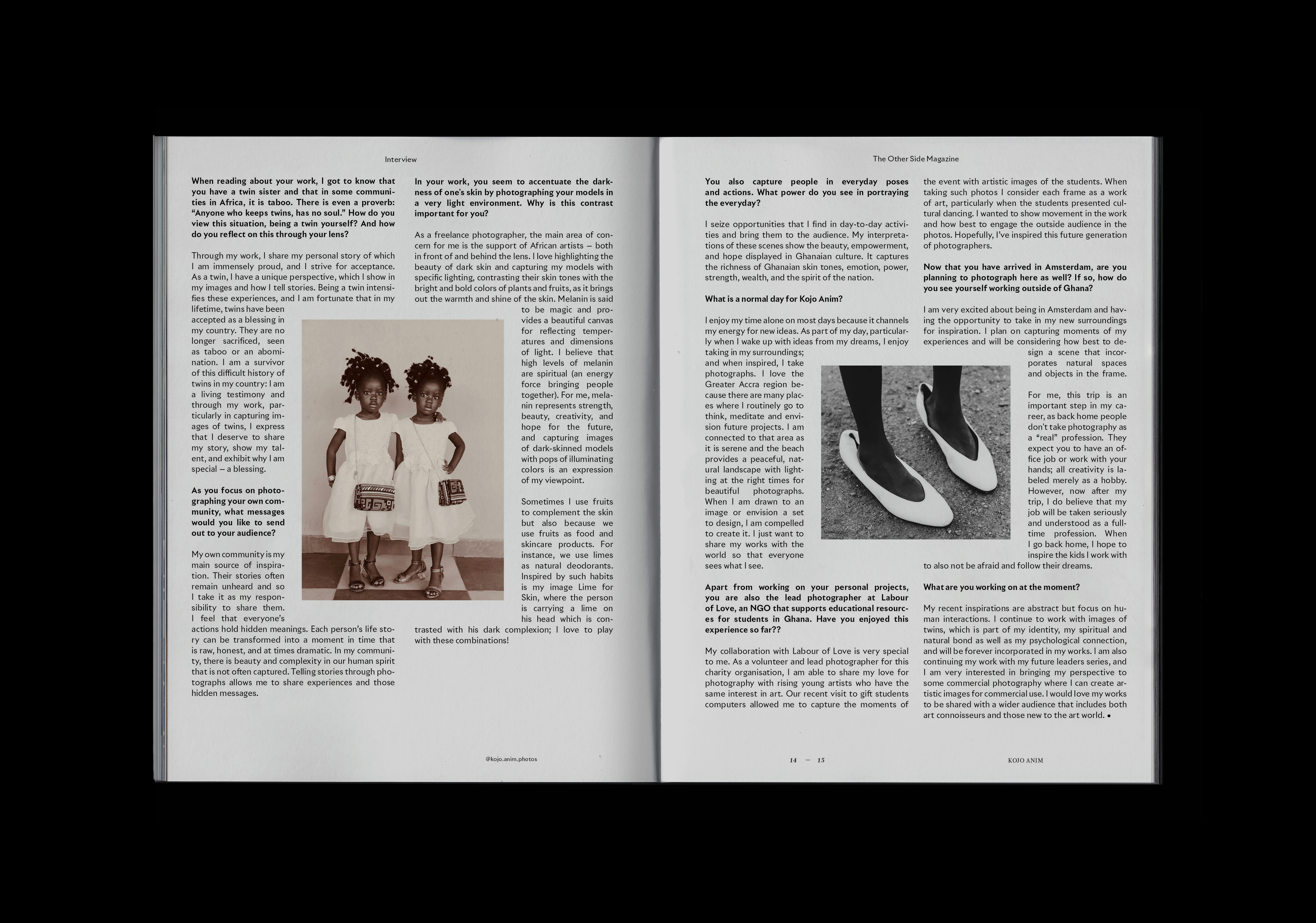
I am a graphic designer and art director based in Amsterdam. After studying design at the Royal Academy of Art in The Hague, I took a position as a book designer at a book publishing branch of local art gallery devoted exclusively to photography. Later, I expanded my responsibilities as the art director of the athlete agency. I always intend to create meaningful, elegant, and bold visual identities, communication strategies, and print publications, all grounded in conscious typography choices, traditional design principles, and thoughtful concepts meant to stand the test of time.
Learn more
All works, Branding strategy, print and editorial design, logotype, typography, Motion design, Digital.
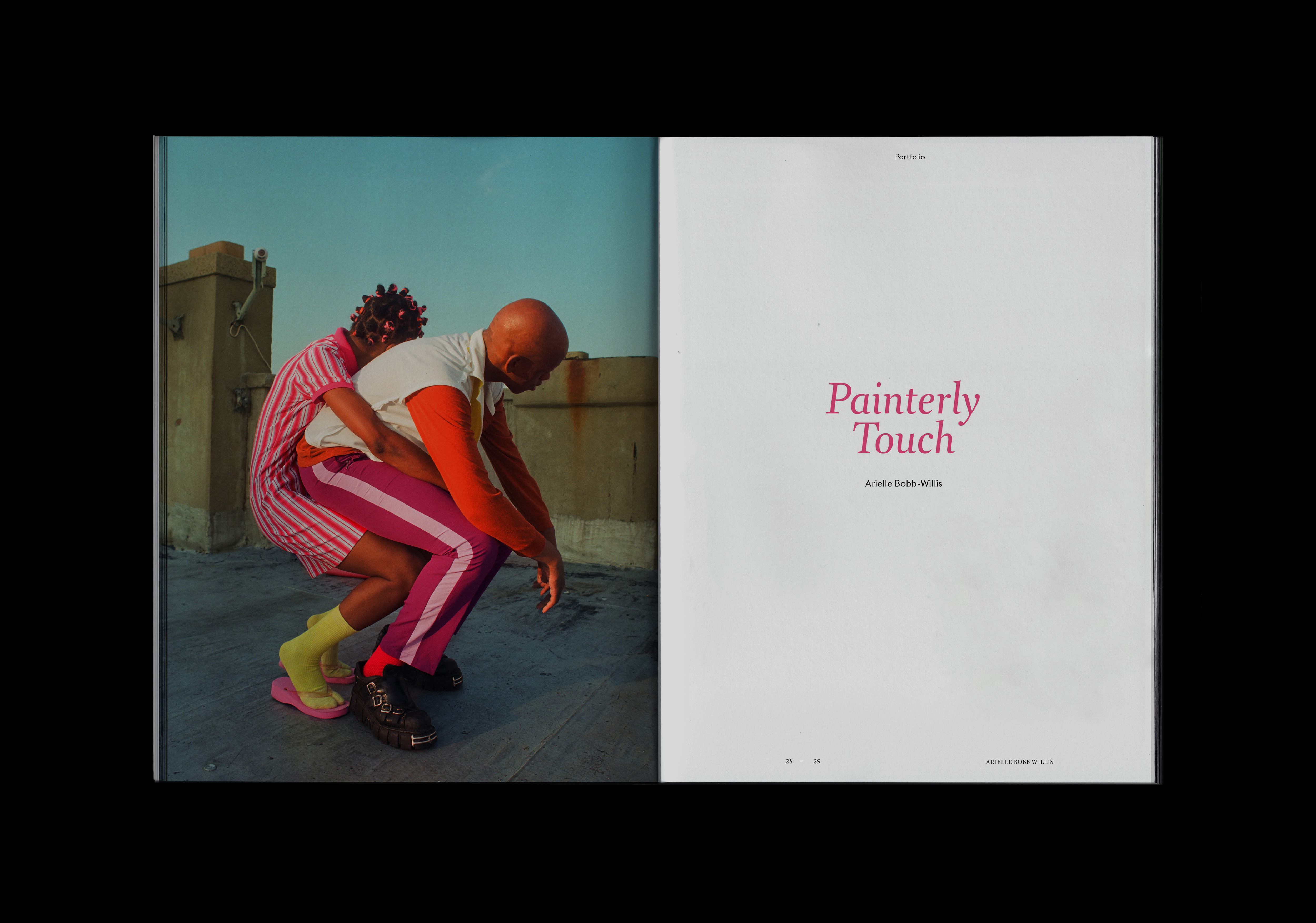
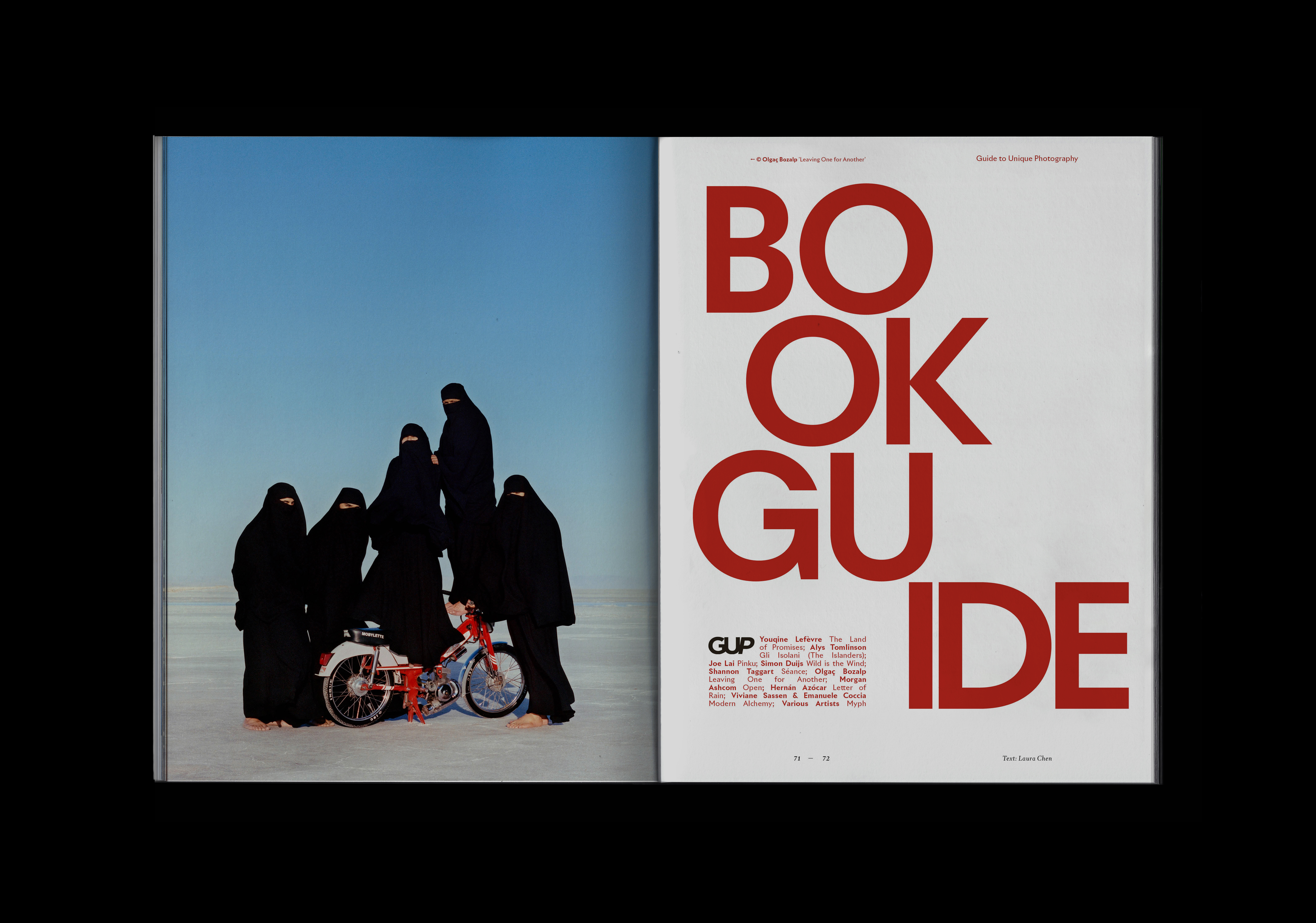
GUP Magazine
Redesign
Brand identity
Book and editorial design
Social media strategy


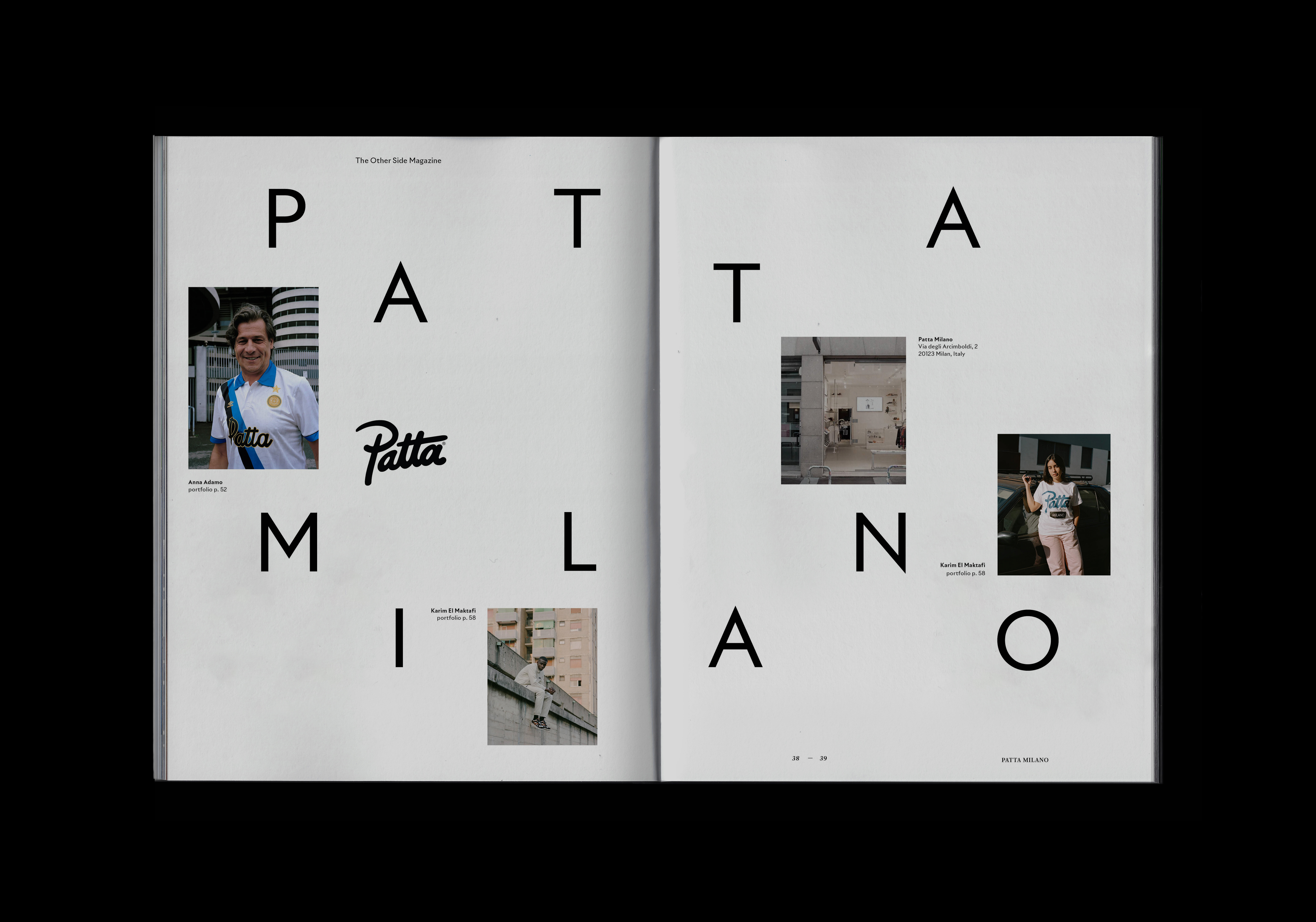
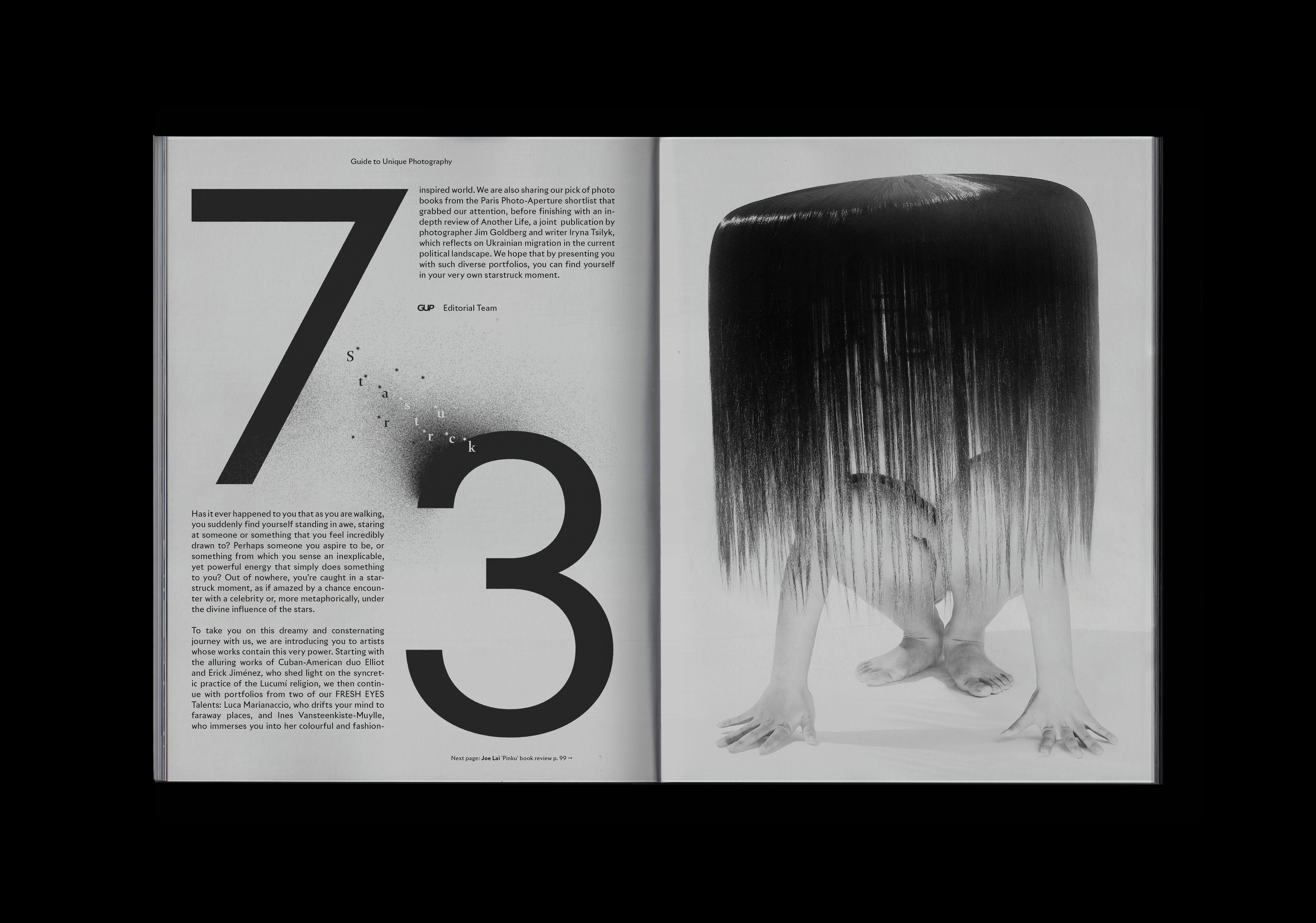
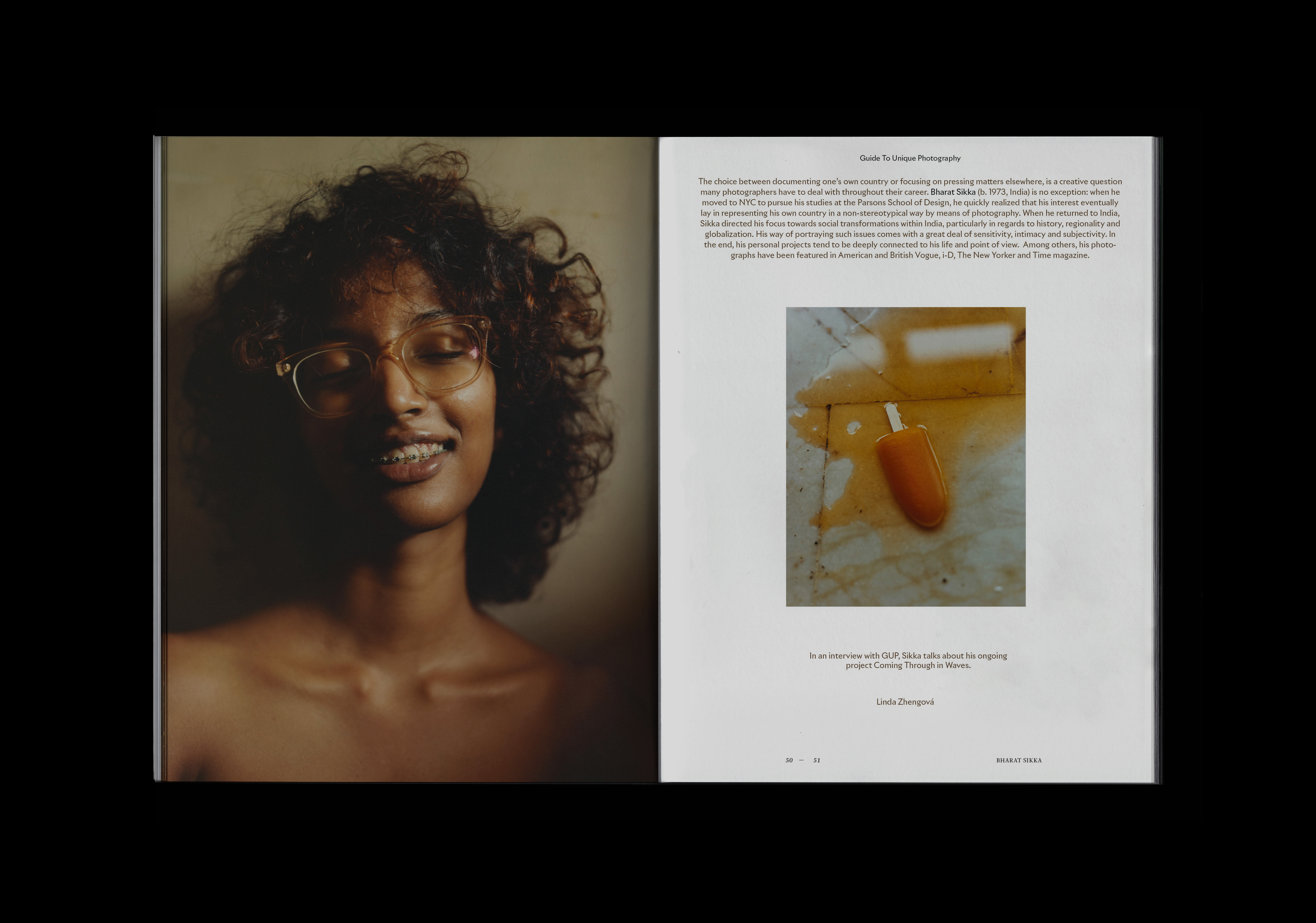
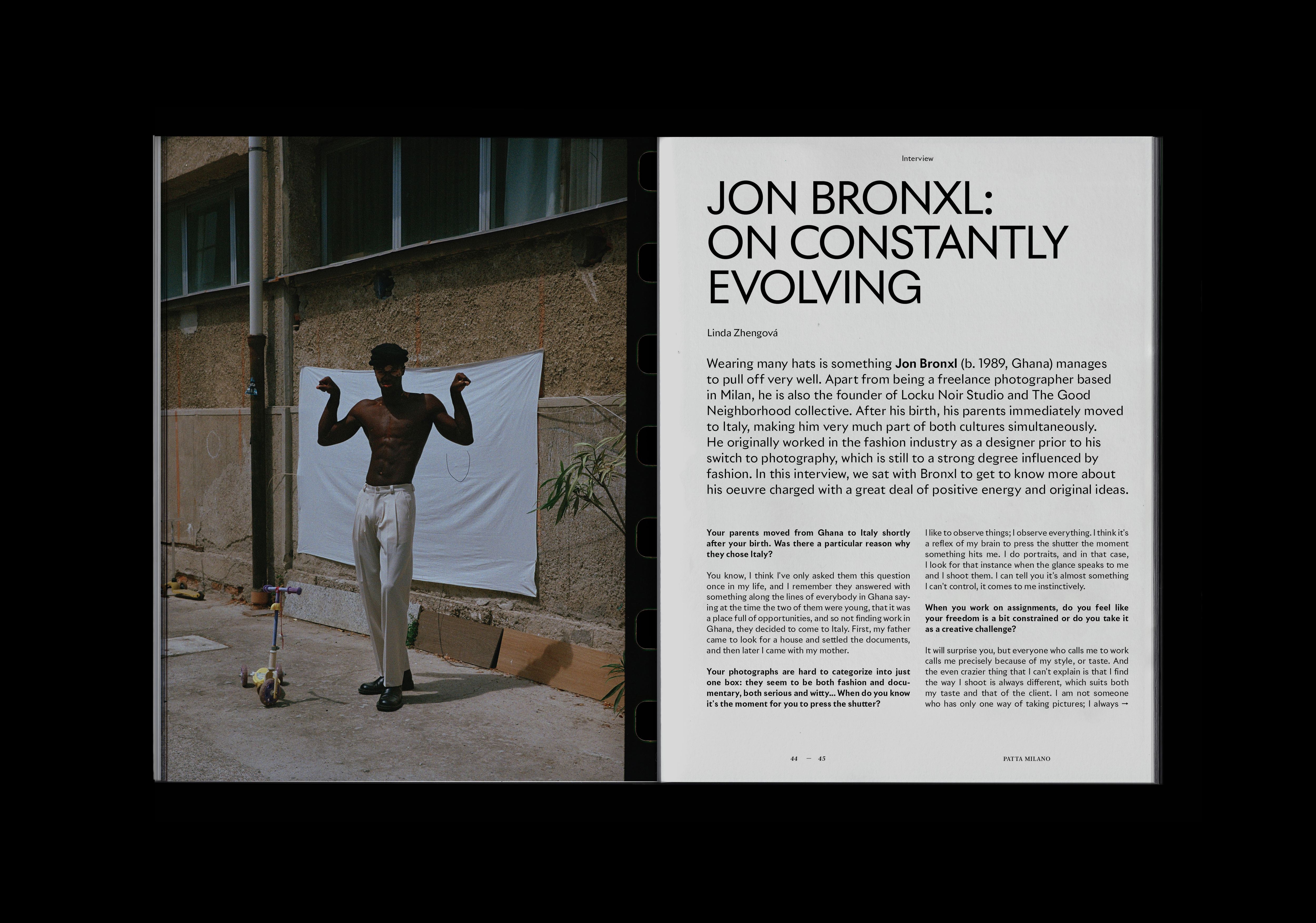
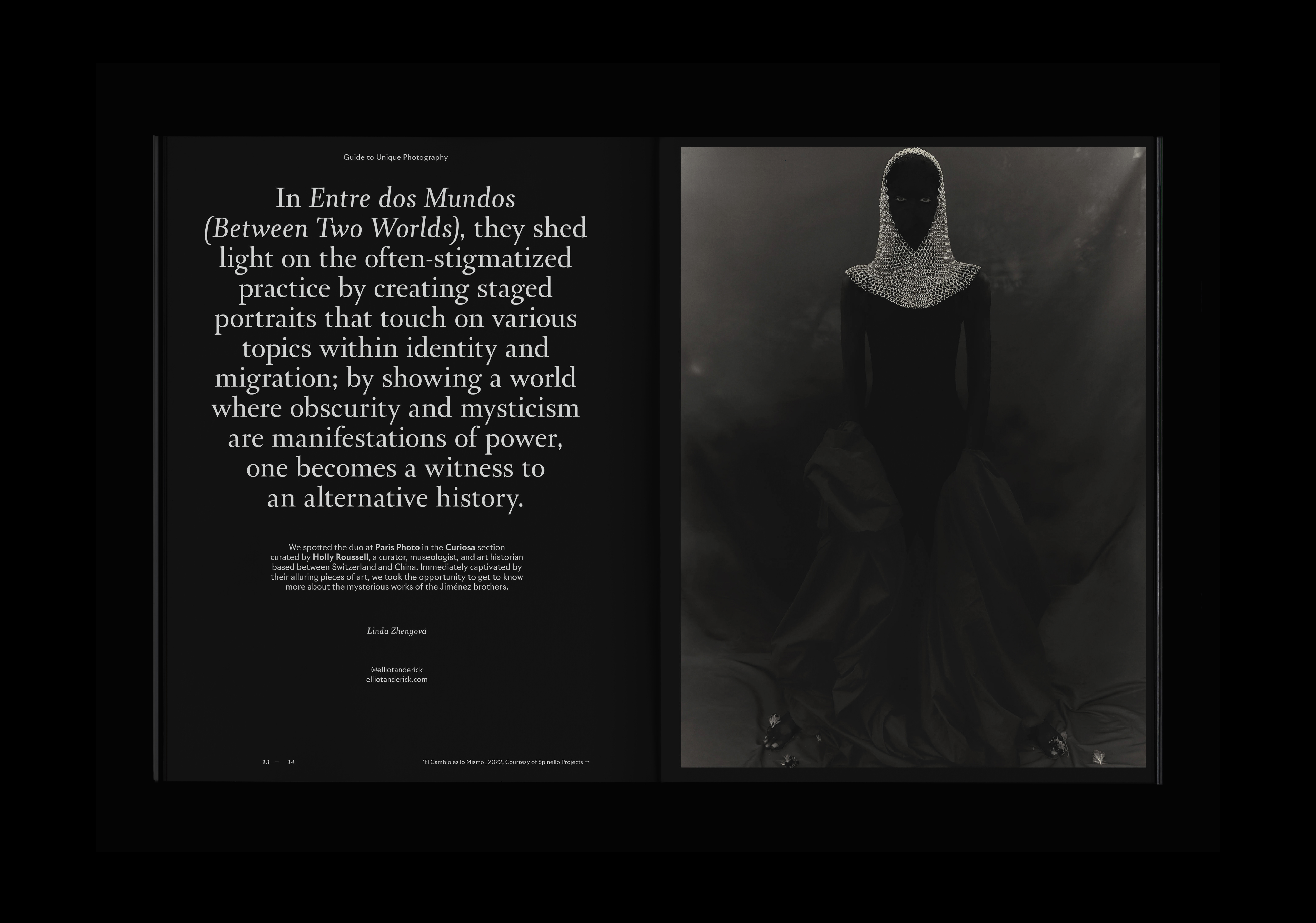
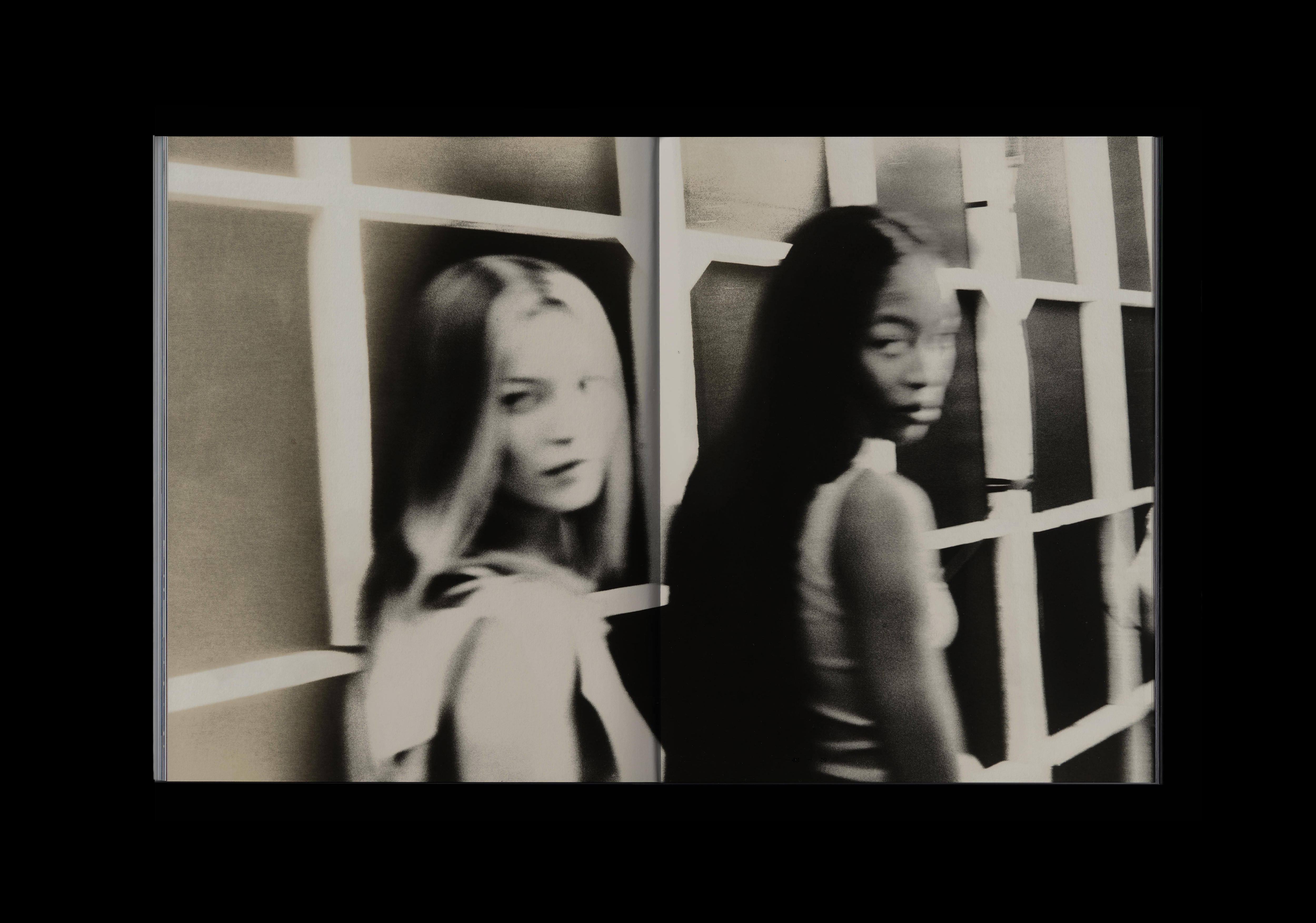
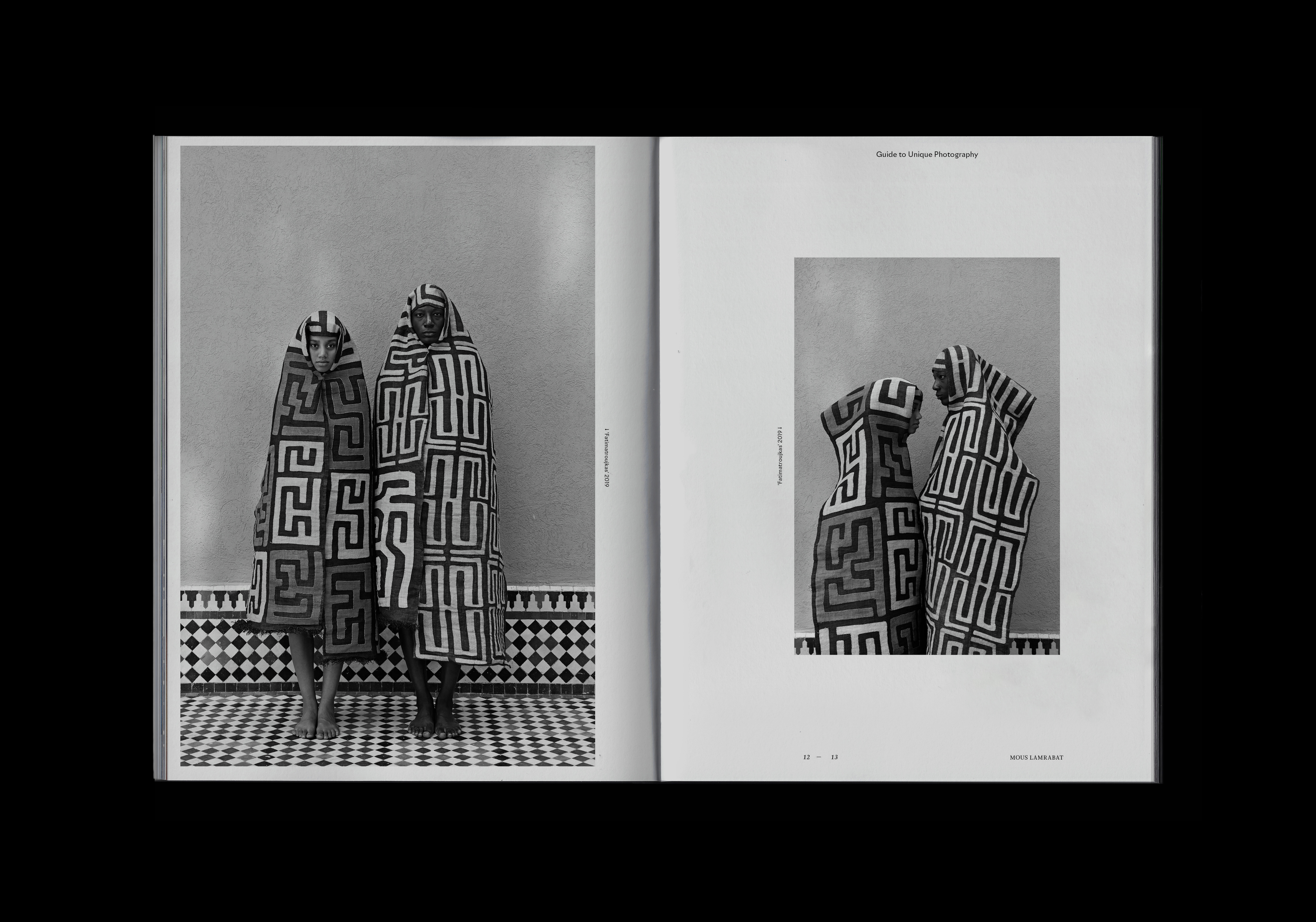
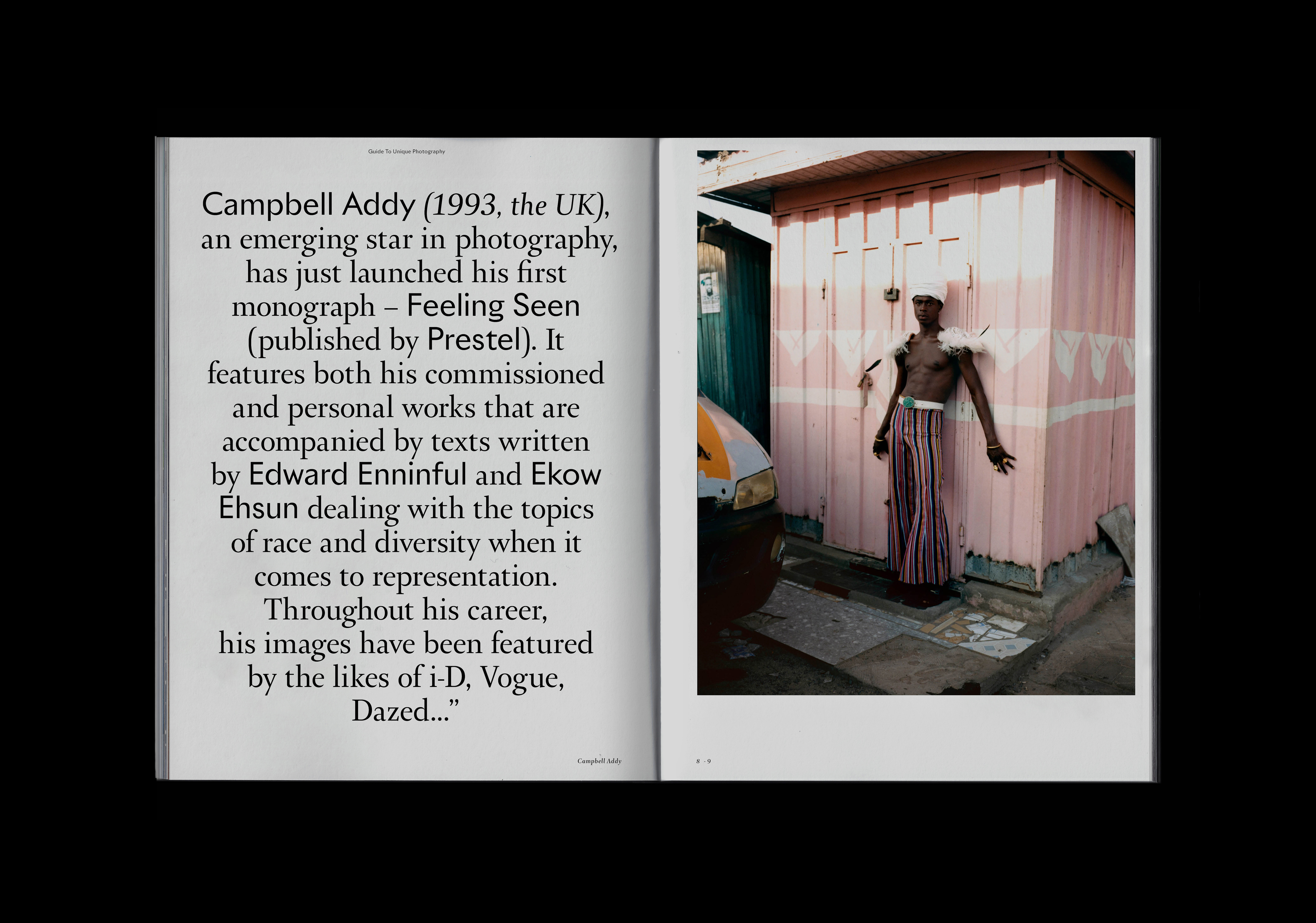
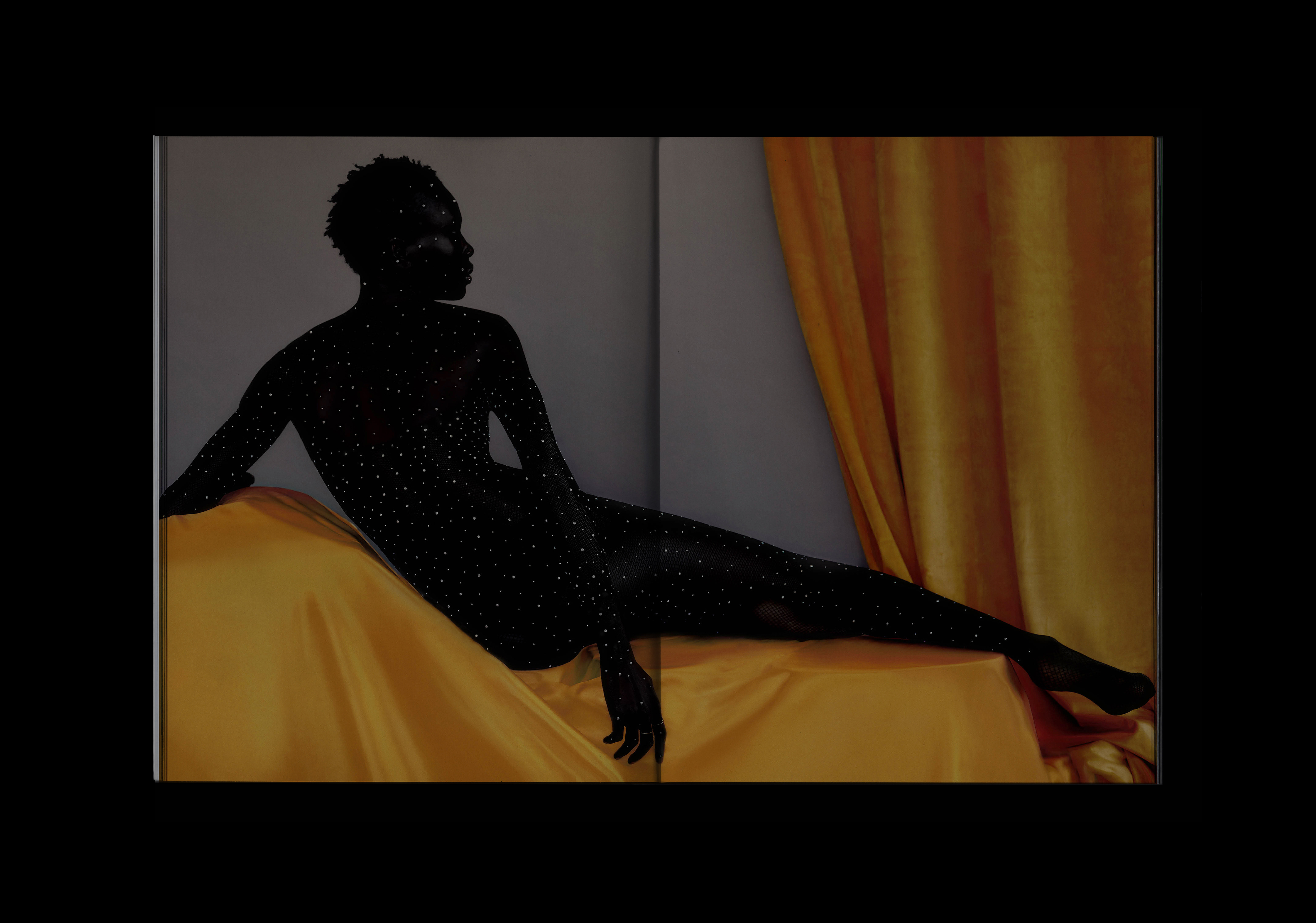
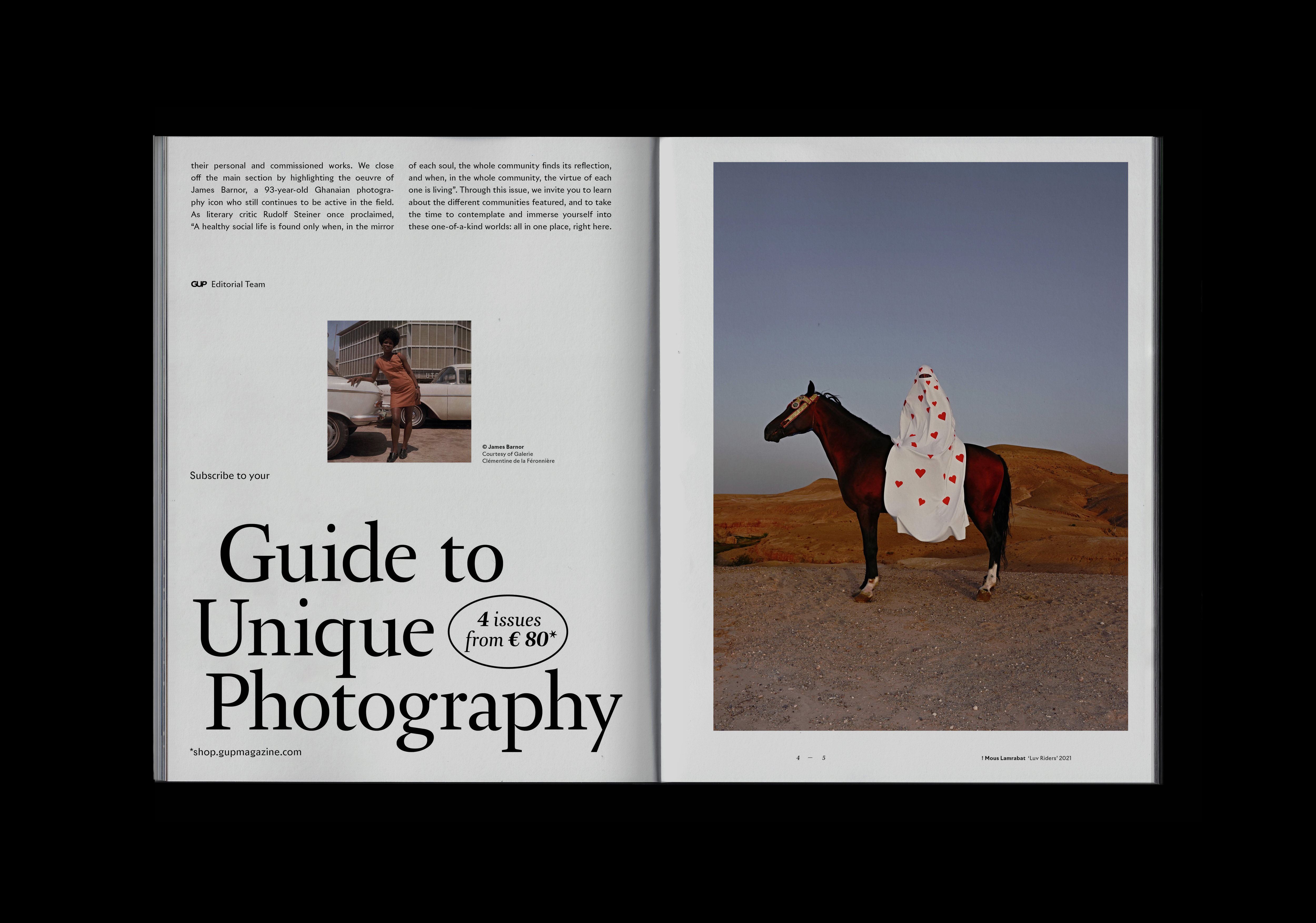
Since 2005, Guide to Unique Photography (GUP) provides a platform for all enthusiasts of photography. Longevity of the magazine makes it one of the longest continuously published photography print issue in The Netherlands. In late 2021 I was commissioned to re-design the magazine — create an collectable item - high-end, simultaneously, playful and dynamic.
The purpose of the re-branding was to adapt GUP to the expectation of modernity. The era of magazines serving as the equivalent of monthly released newspapers appears outdated - a new GUP is meant to be a coffee table book, preserved with care and finally destined to be stored in home library.
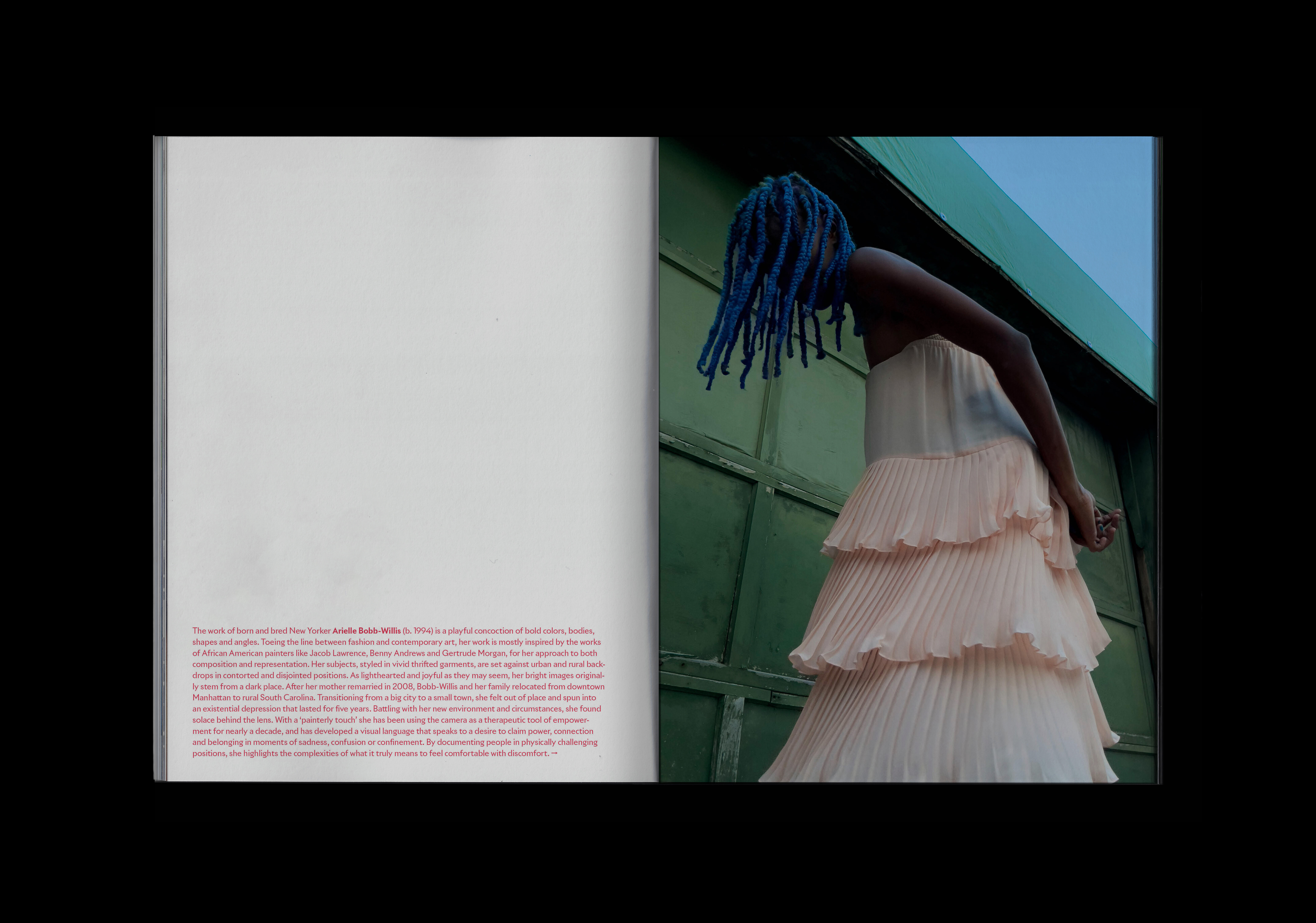
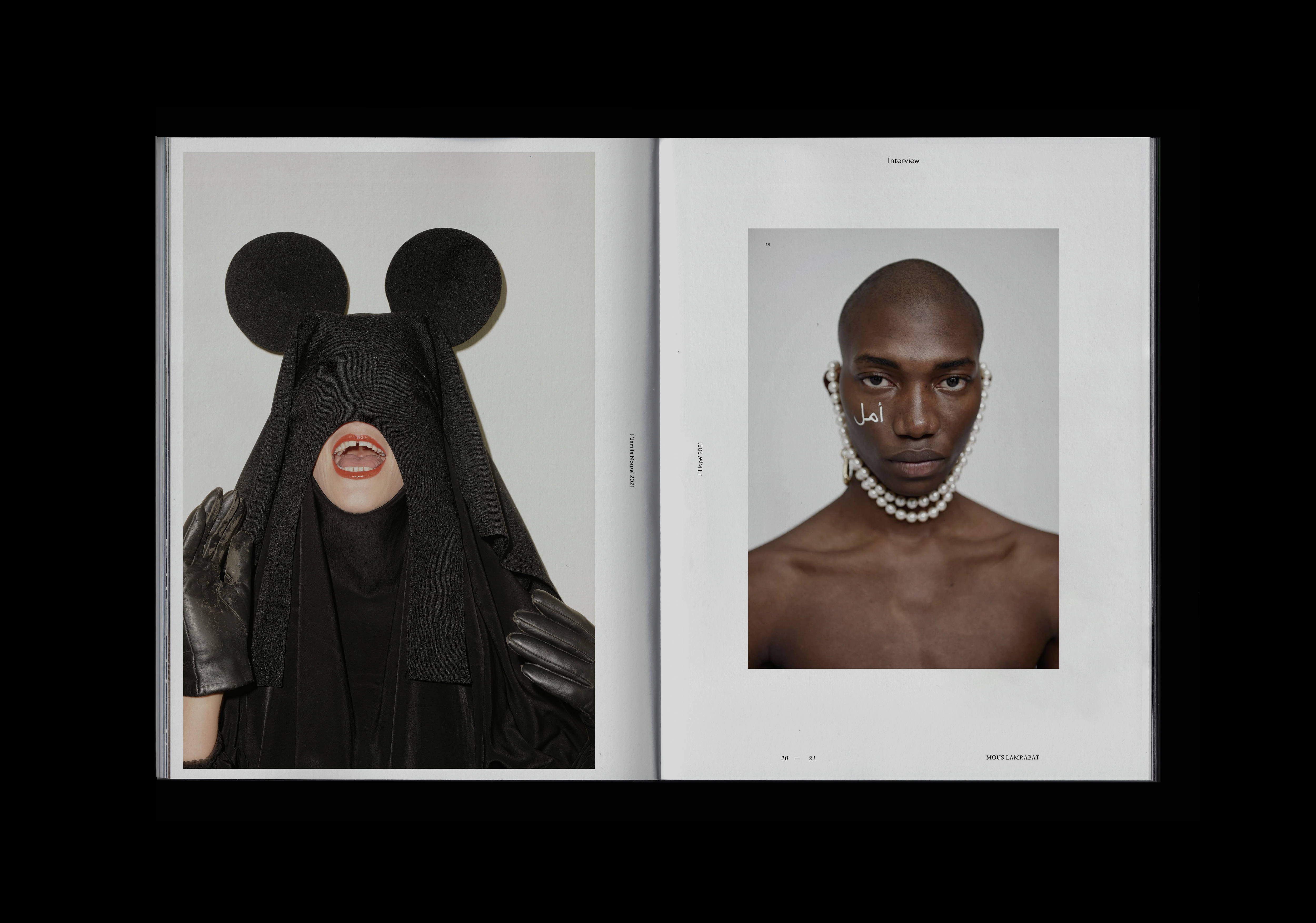
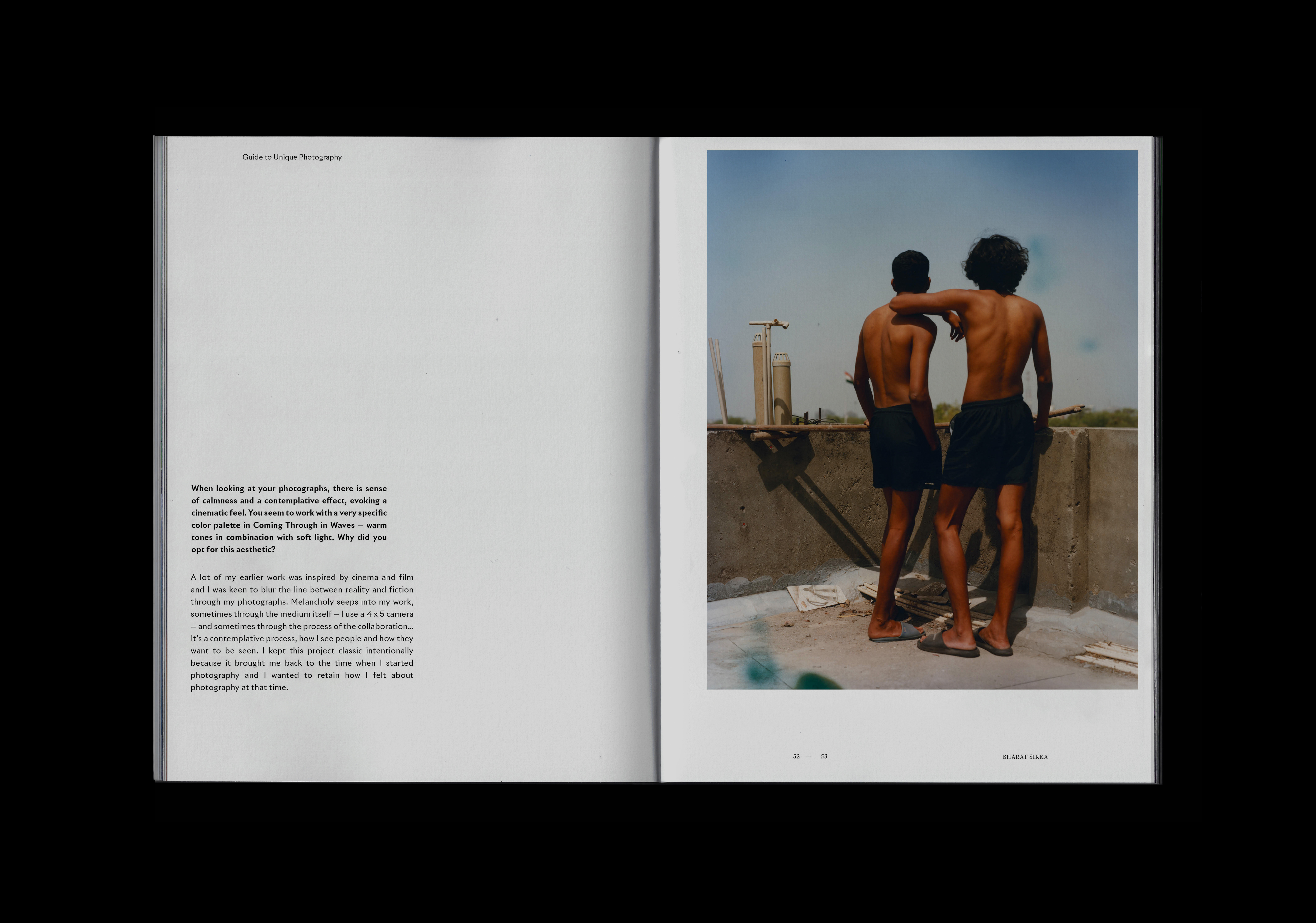
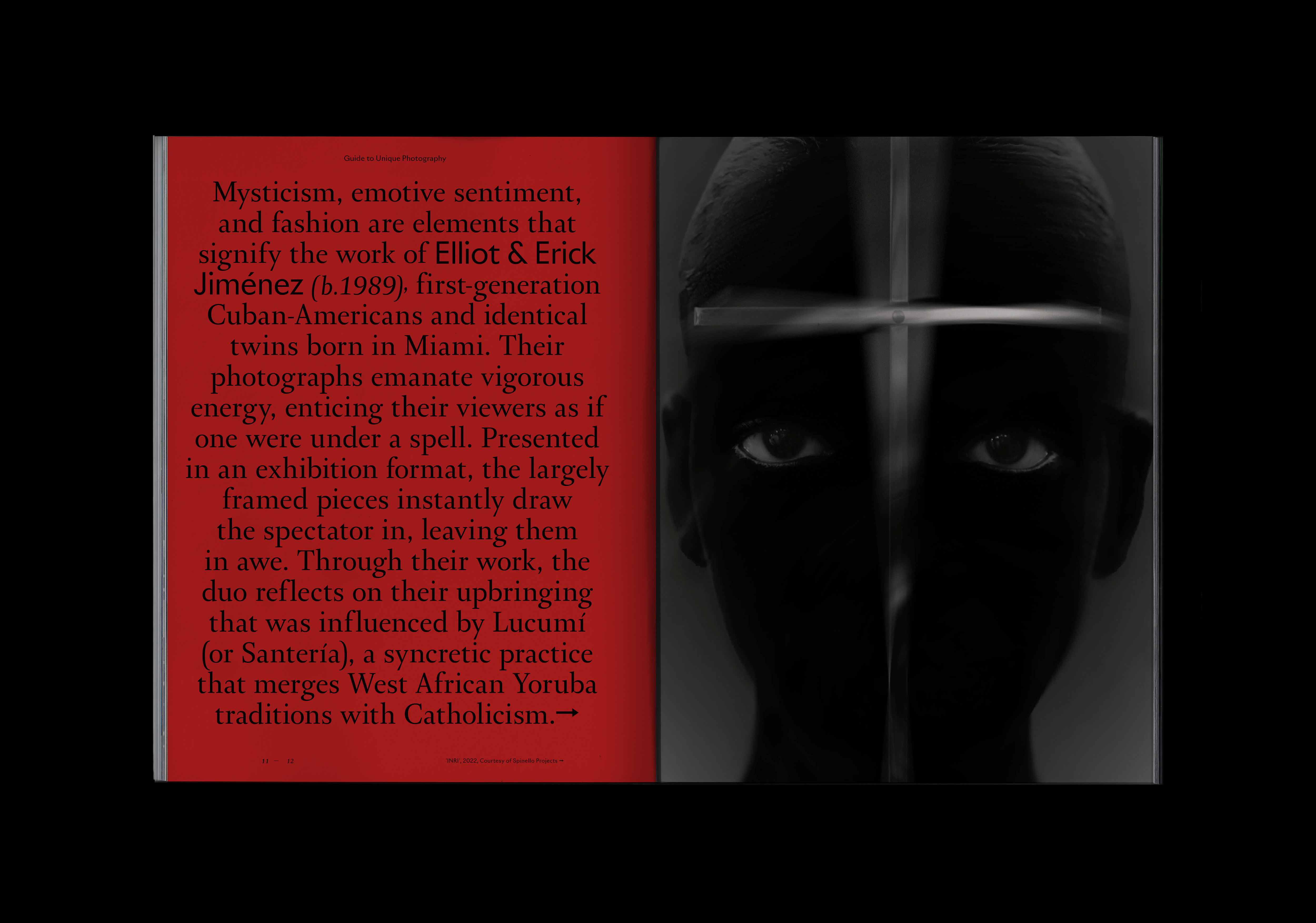
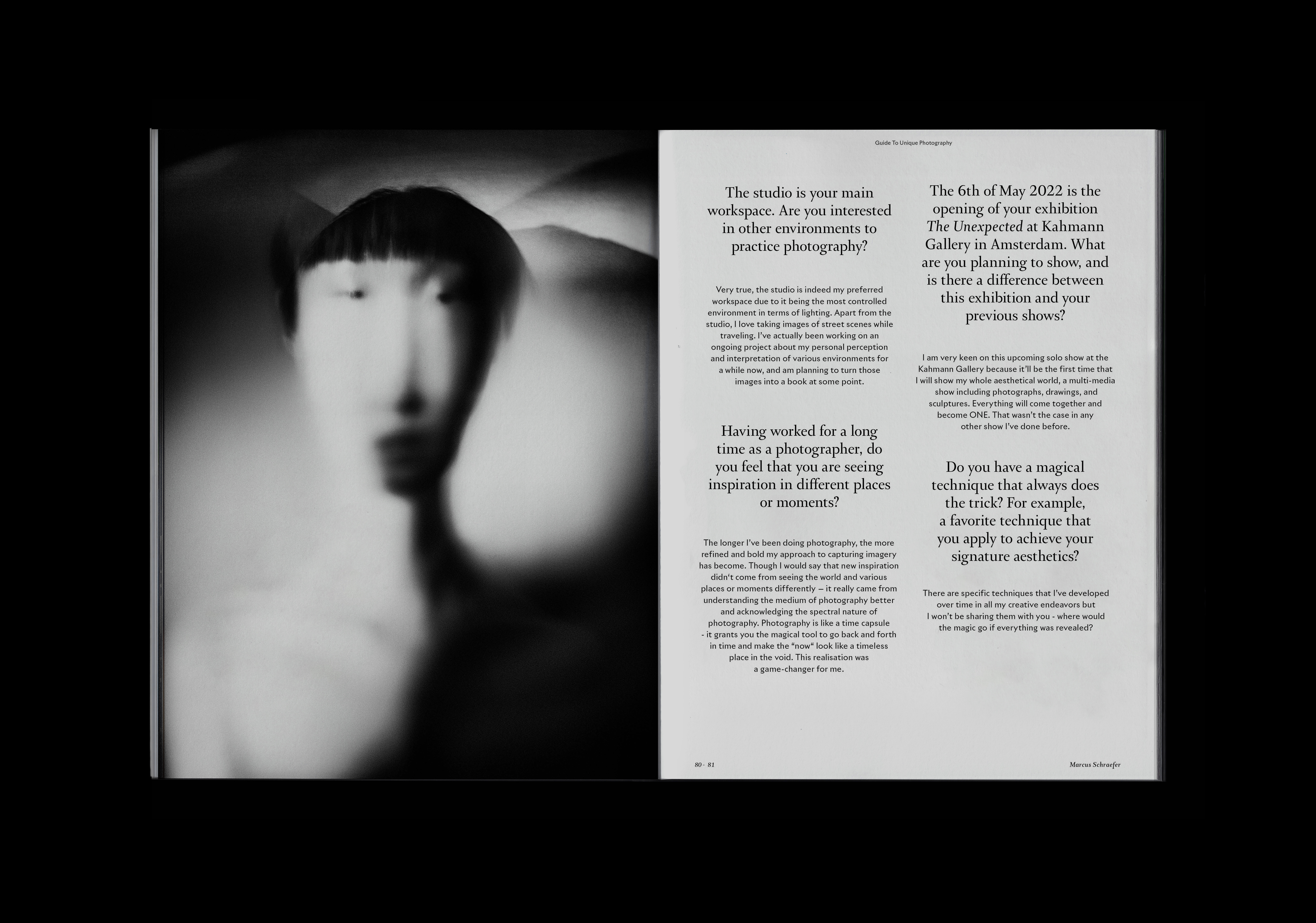
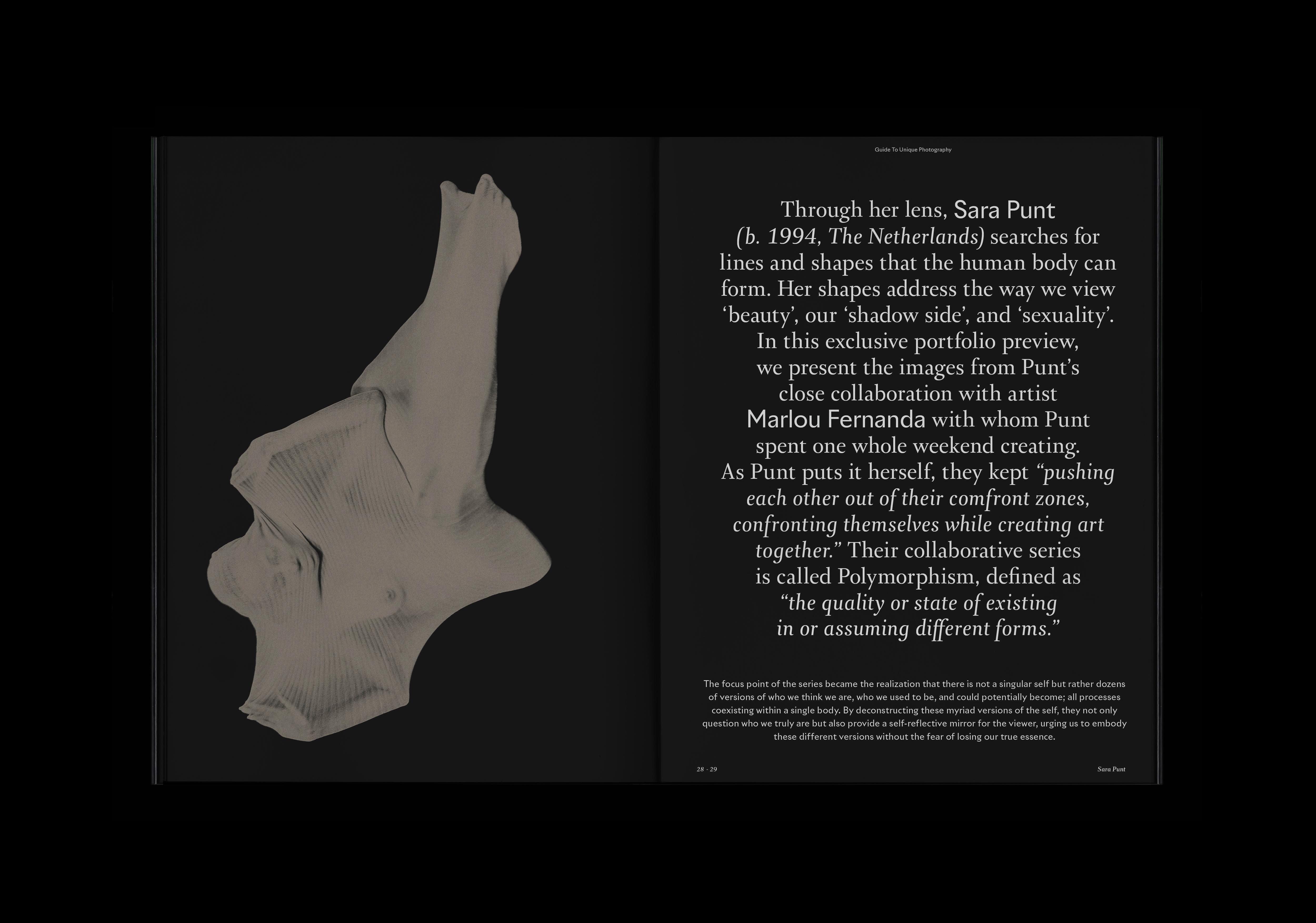
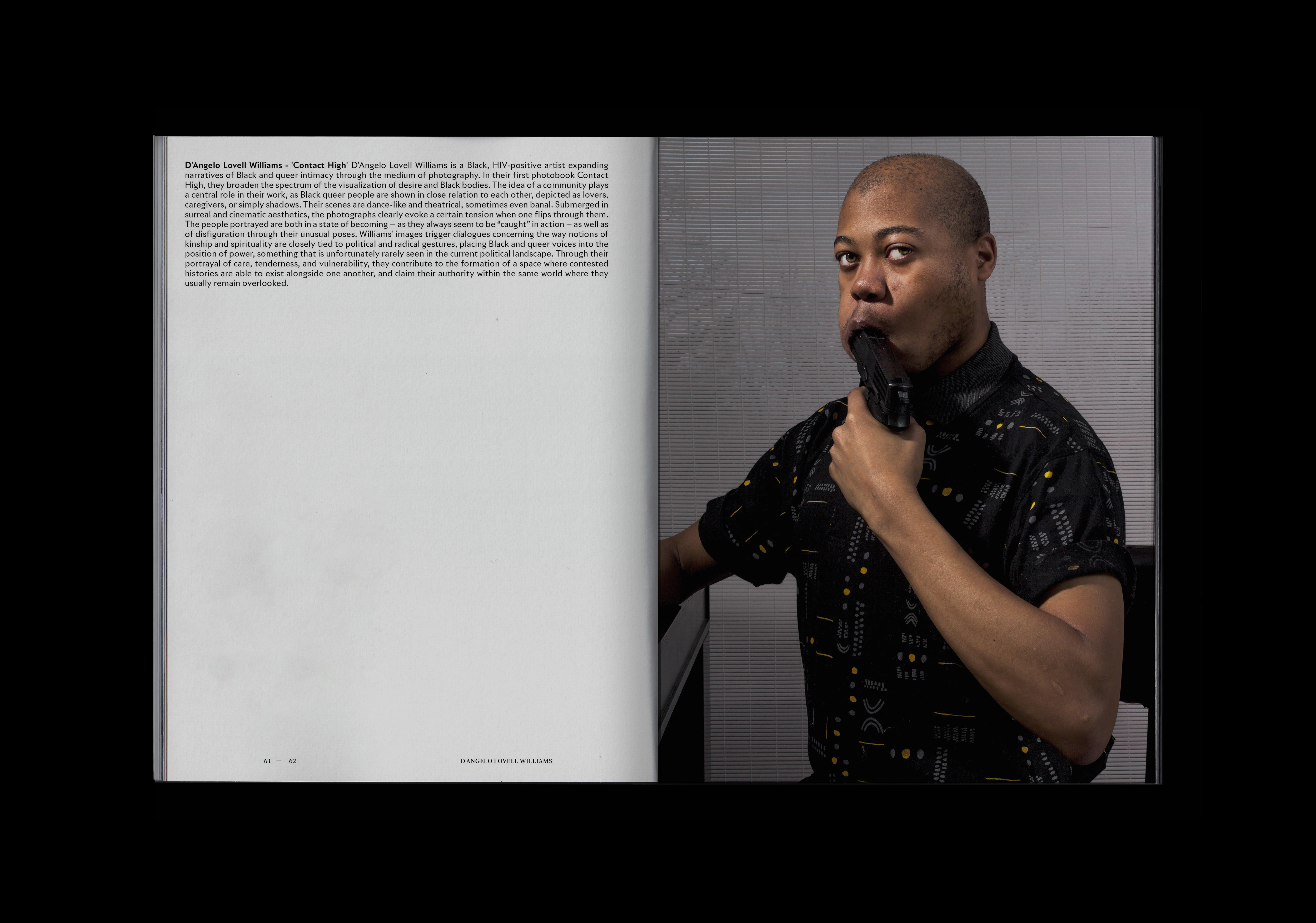
Each chapter is designed individually to accomplish presented portfolio - in likeness of art galleries, adjusts the colour pallete and configuration of display walls. GUP is an easy reader - large and playful introductions can be read effortlessly before discovering the article for more details. The mayor focus and purpose of the magazine is to deliver high quality photography, therefore image always leads the composition. Two families of typefaces are in use throughout the whole magazine and their configuration depends on the character of presented works.
Beside from developing a new design of the print issue. I also design a new house-style of the digital presence of the magazine - visual key for all of the online activities, including a wide range of motion design, to improve quality of daily communication.


More Than Goals Agency (MTG)
Art direction
Brand identity development
Social media strategy
Webdesign
More Than Goals is an Amsterdam based, international athlete agency where professional sport meets the high-culture. MTG shares experiences and the extensive network to a next generation of exceptionally talented football athletes as well as independent creators and creatives in arts, media and design.
MTG beside of athlete management, in also an holding company for multiply cultural platforms such What’s Culture and Other Side Magazine. The fundation for the art direction is a photography curration and settle graphic design.
Rebranding determined a new and consistent typography style as the addition to existing trademark, a grid and the extended colour pallete with rich tones of green, brown and beige, extracted from the photography the agency has comissioned. Previously, MTG was branded with just black and white images and block letter typography. By applying a new pallete, reminiscing nature, soft, tall and gently oval letterstyle I intended MTG to be more relatable - important factor taking into consideration the educational and community building status character of the institution.

‘Grot’ Jonny Kaye
Book Design & Campaign
Book Design
Editorial Design
Illustration
Silkprinting

‘Jonny Kaye’s debut book GROT is an expansive collective portrait of UK’s kink and fetish community. Compiled from the photographer’s archive, it depicts gimps, pro-dommes, sex workers, fetishists and queer friends unapologetically expressing their erotic selves on camera. GROT is an archive for the community and an active protest against cultural censorship. The word grot usually means “something unpleasant, dirty, or of poor quality” but, for Kaye, it signifies “the liberation behind embracing your inner filth”. - ’ Dazed Magazine, 2023.
Since the book is an oeuvre, organized firstly chronologically, further, curated into photo sequences ‘within’ each year individually - time was a key factor. Artists slogan is ‘Sorry Jonny is Dead’ therefore I knew the book has to be lust and memento mori.