Patta Athletics
A new branch of internationally acclaimed fashion brand Patta.
Identification system
(In development)
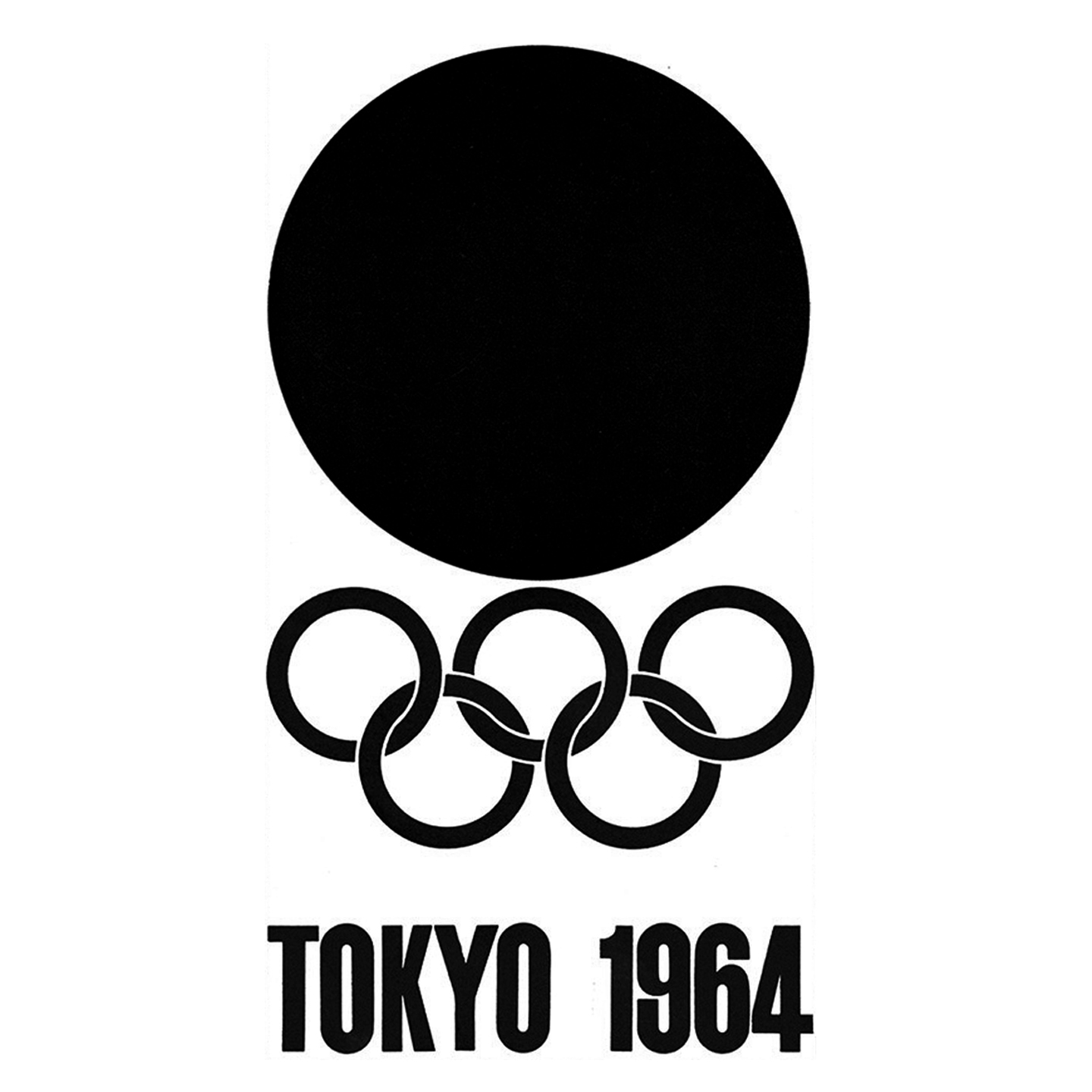
Inspired by Olympic Emblems 1964 (Tokyo) up to 1988 (Seul) I follow logical foot-steps of designers of my personally favourite graphic design era. Throughout the time, designers such Georges Huel challenged themselves to deliver minimalistic, clever and sophisticated reference of the game’s current at the time location and implement it in correlation with the Five Olympic Rings symbol in most co-herent and visually appealing way possible.
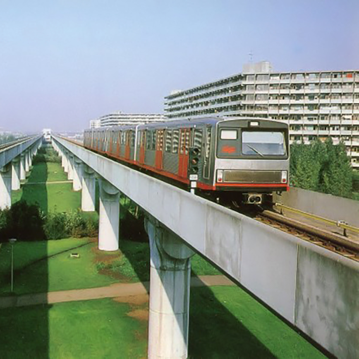
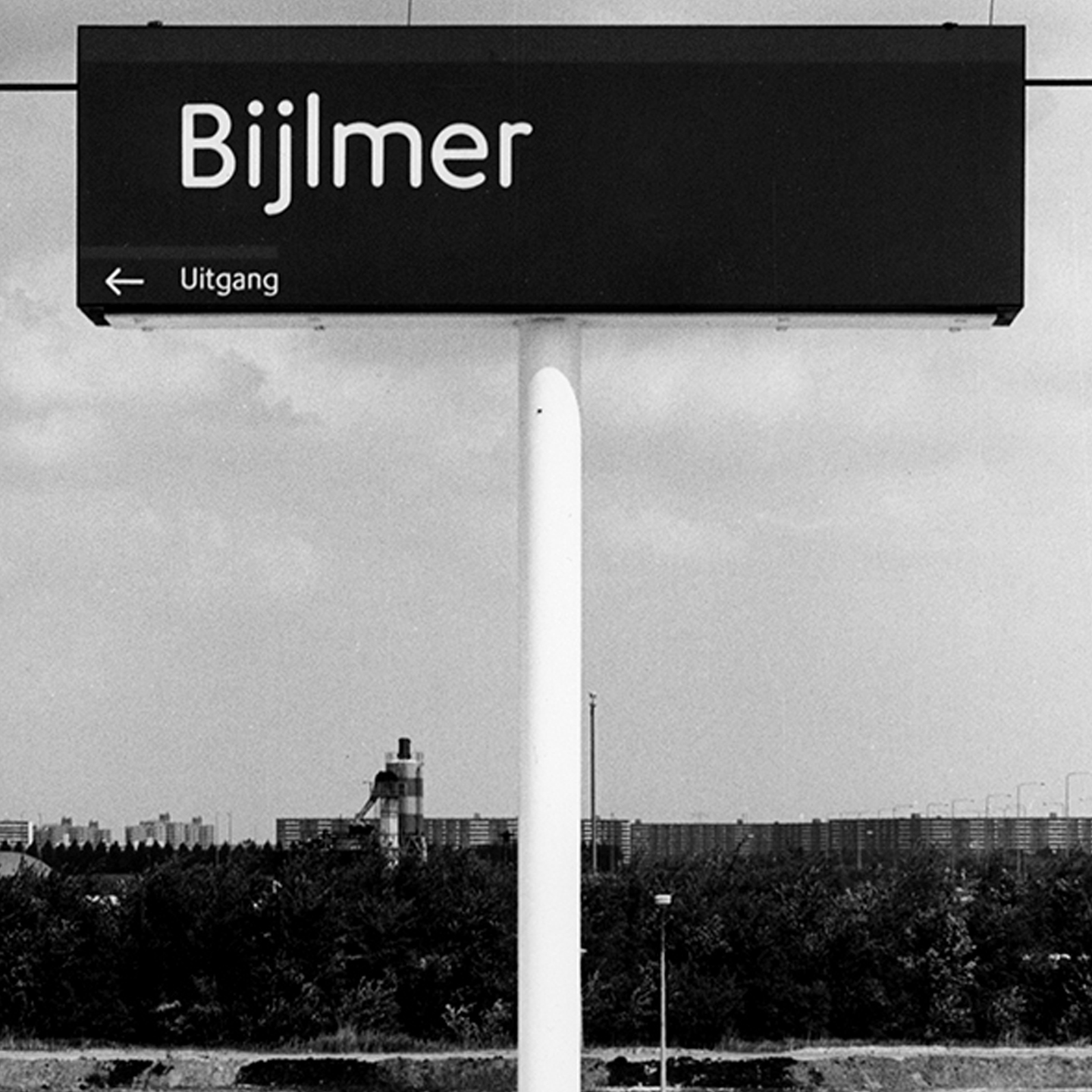
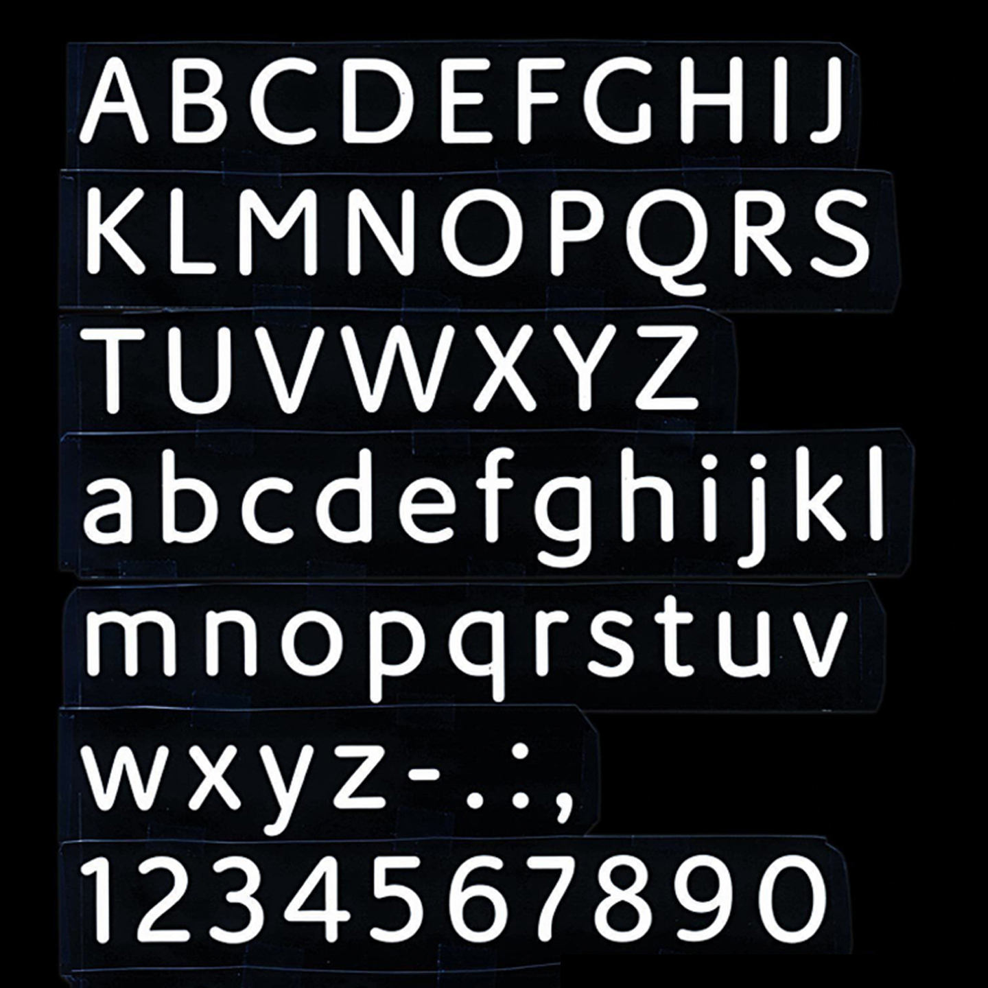
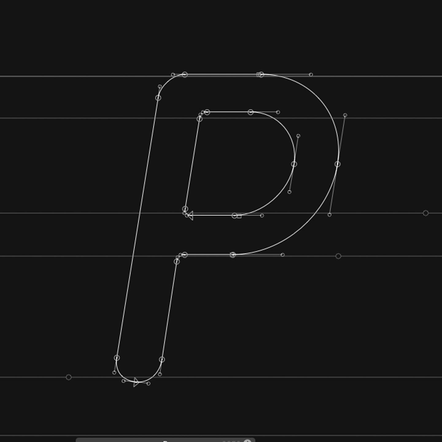
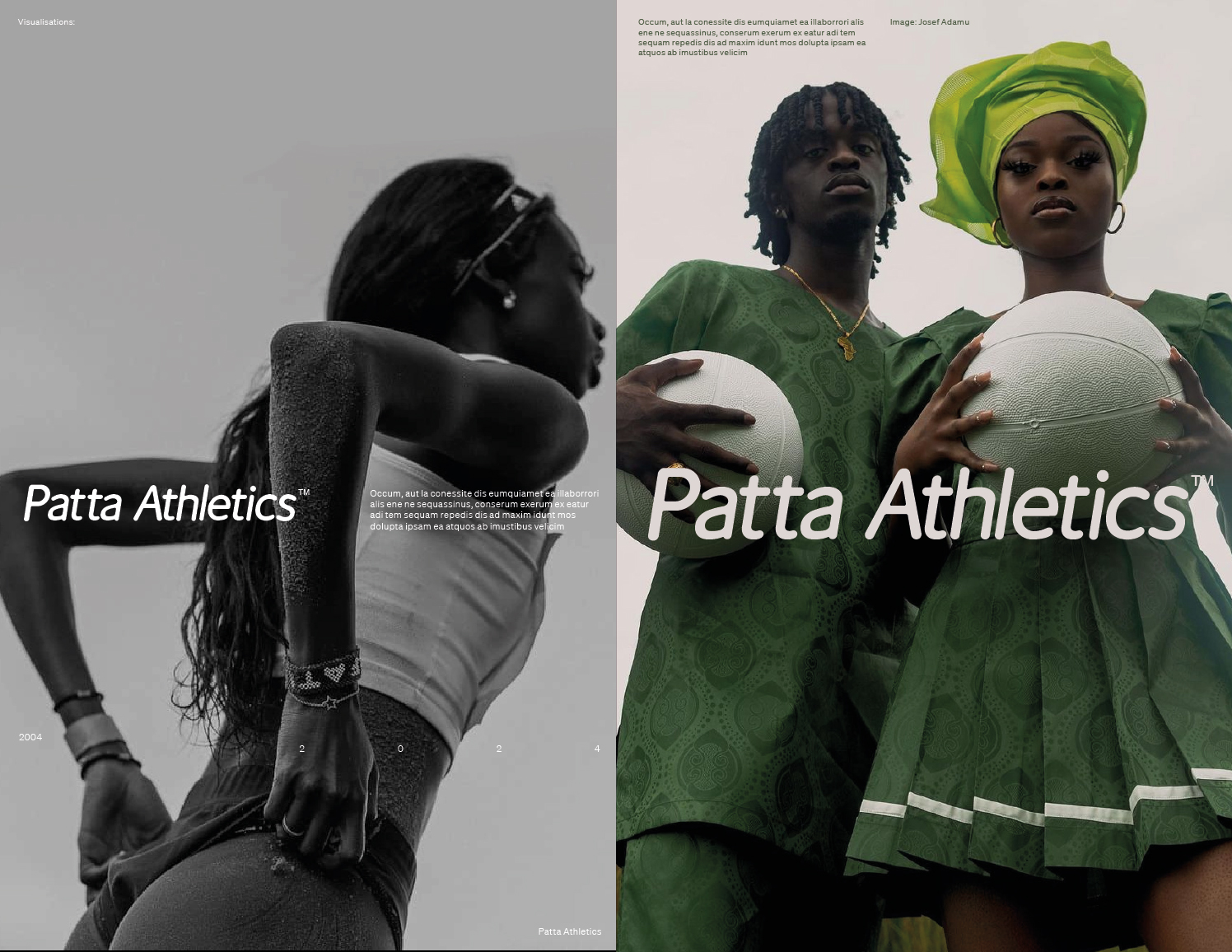
Patta Athletics, community building sport institution pays homage to distant boroughs of Amsterdam and one of greatest Dutch designers Gerard Unger at the same time. The metro platform, home to one of pioneer European graffiti scenes is a conscious nod to Hip-Hop Culture roots of Patta, yet, transit companies logo, just like sport brands, manifest their dynamism with a clear router or slant therefore I find the concept to create replica of ‘MOL’ - the original typeface designed specifically for the metro system in Amsterdam, by great late Gerard Unger most suitable choice. To give it a sport character, I designed the italic, non-existing before, variant of the letterstyle.
