Hera United embrace masculinity and set new standards of football aestetics. New
approach to football fashion, scarfs, card stunts is inspired by the most groundbreaking
artists and designers. We intend to establish Hera United as a leader of the new
chapter of global football.
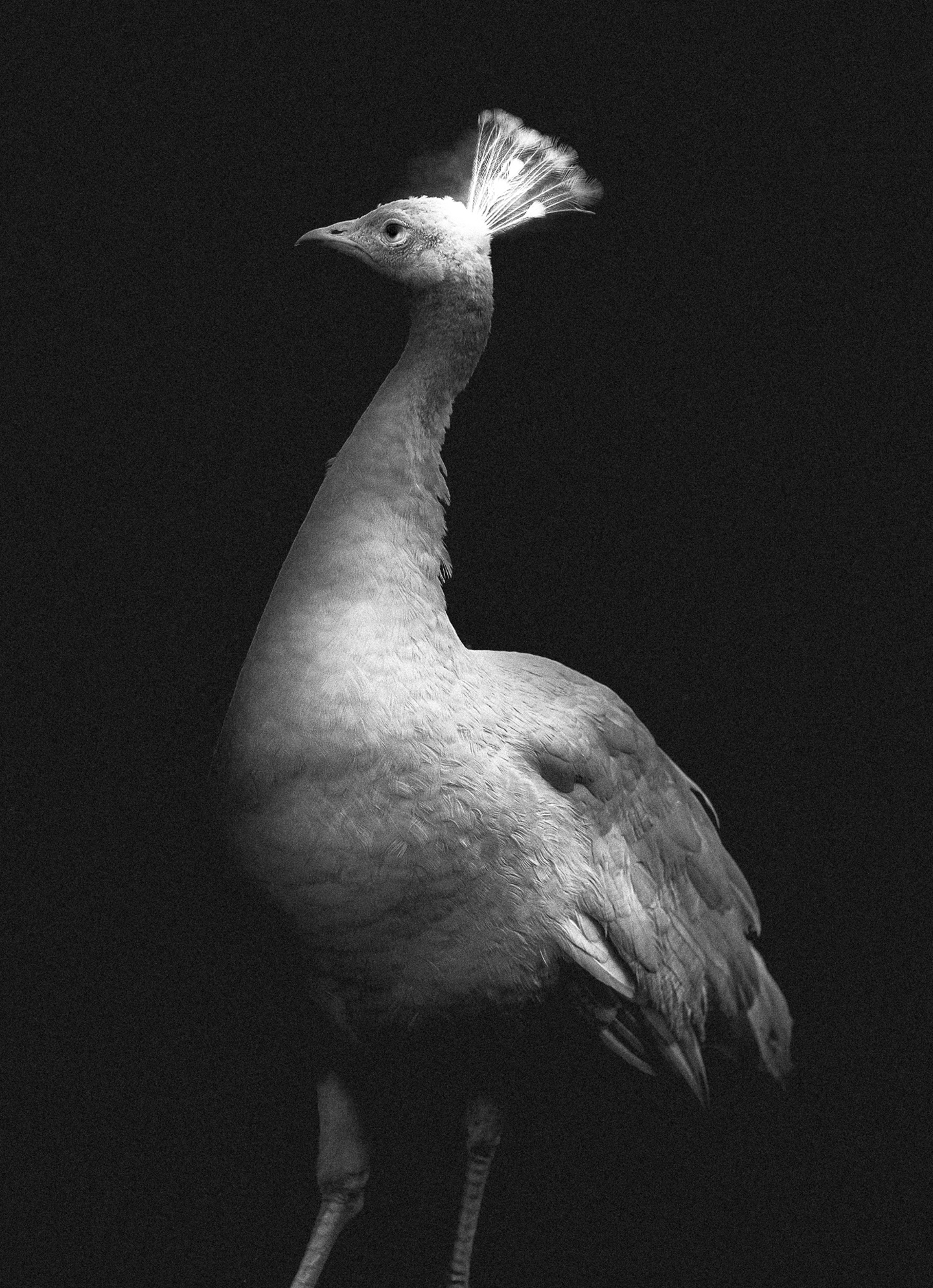
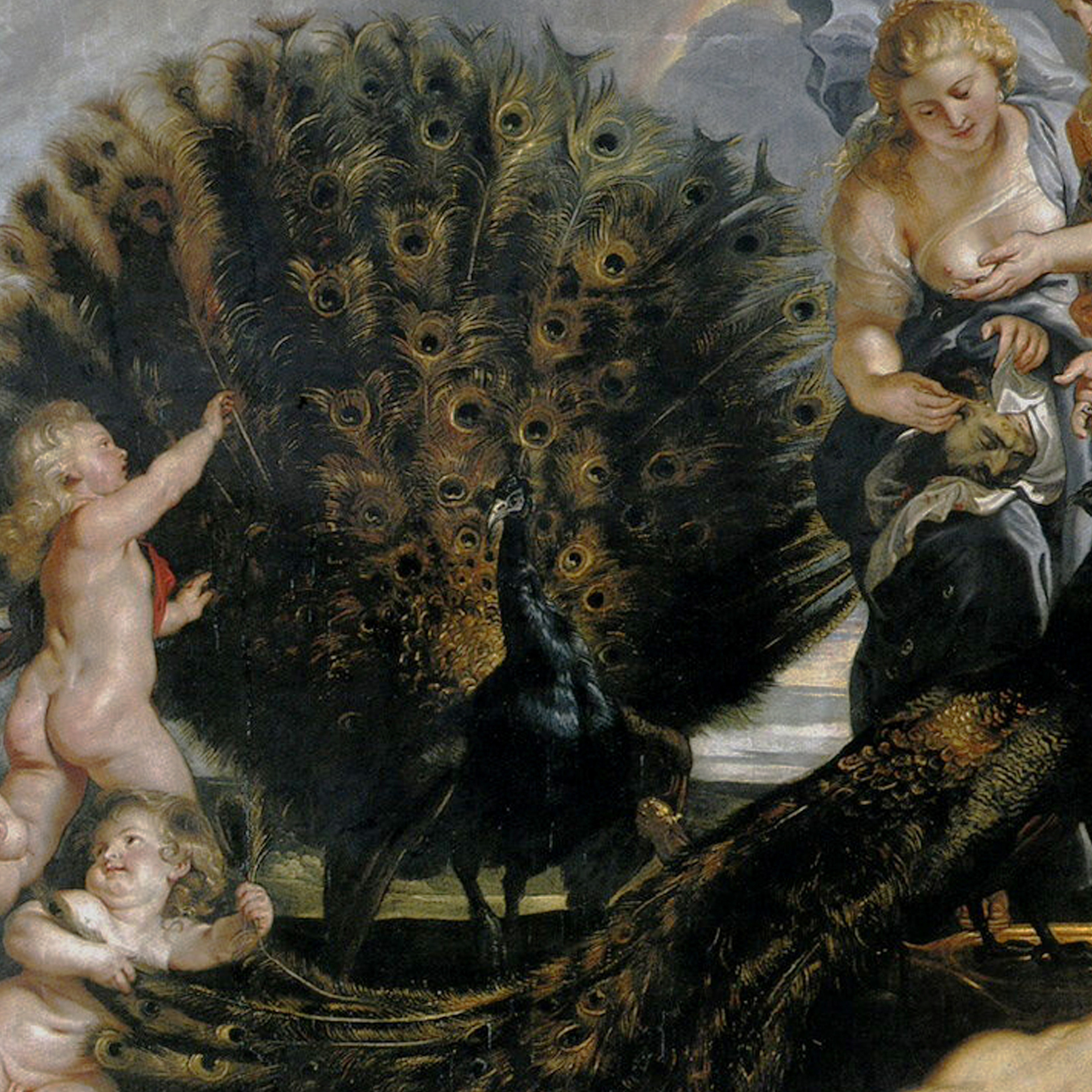
The peafowl splendorous and majestic animal is an another symbol of Hera.
Peafowl associates with the elegance and grace. It’s also symbol of royalty and power. We reference the feather ‘eye pattern’
and it’s signature geometry - resembling simultaneously a luminosity,
royal diadem and football.
Quirky, light sans-serif letterstyle characteristic for works of Dutch graphic designer Nicolaas P. de Koo (Amsterdam, 1881)
stands the test of time and suprise with elegance and modernity. With help of Thomas Gravemaker founder of Letterpress
Amsterdam we learn this kind of lettering, paint it with gouache, was taught at Rietveld Academy untill 1970s.
